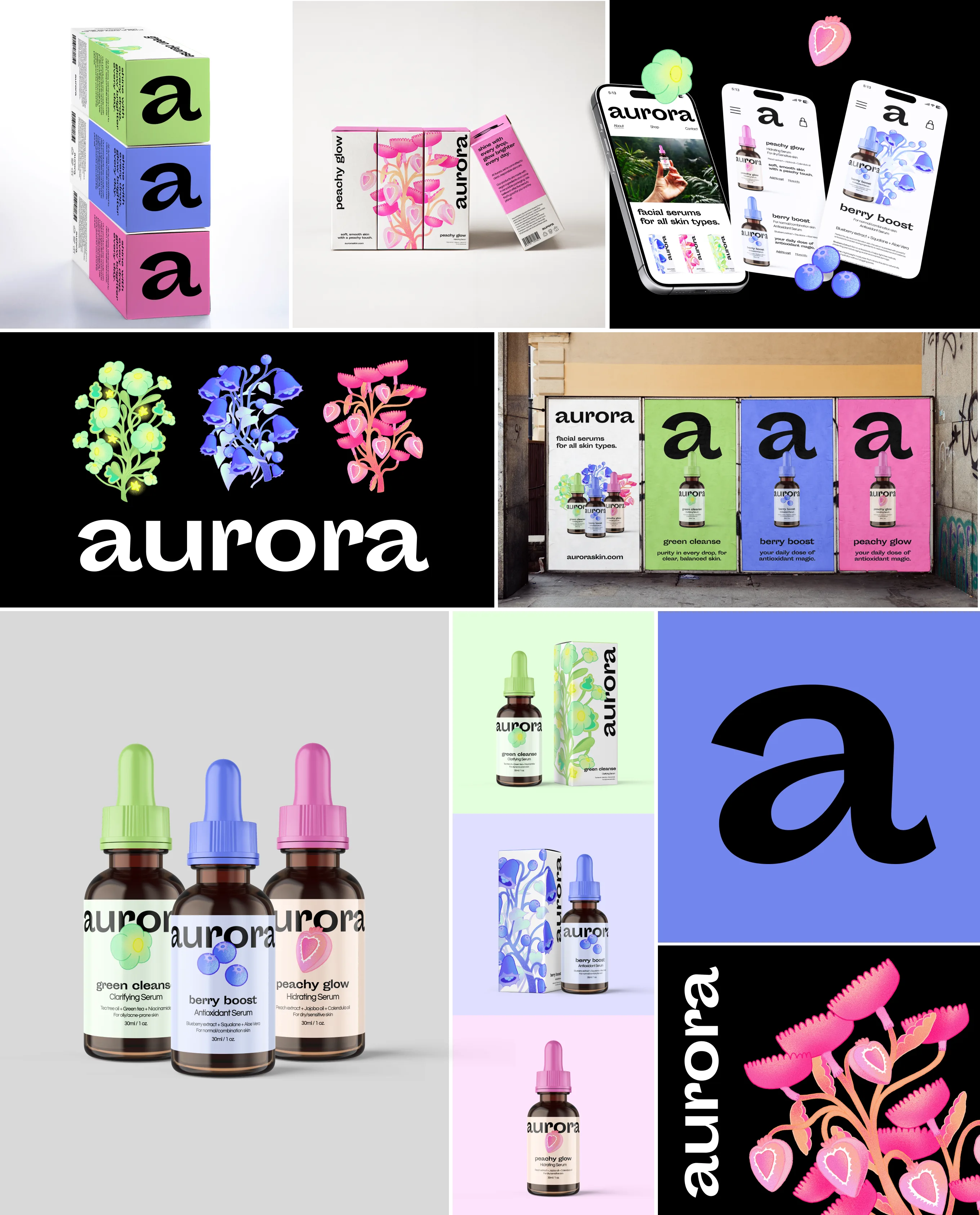
Aurora is a skincare brand centered around light, beauty, and conscious care. I developed the visual identity across packaging, original illustrations, promotional materials, and the concept for a mobile app. Inspired by nature and the luminosity of the brand name, the identity combines a refined visual language with Aurora’s vegan and cruelty-free values.
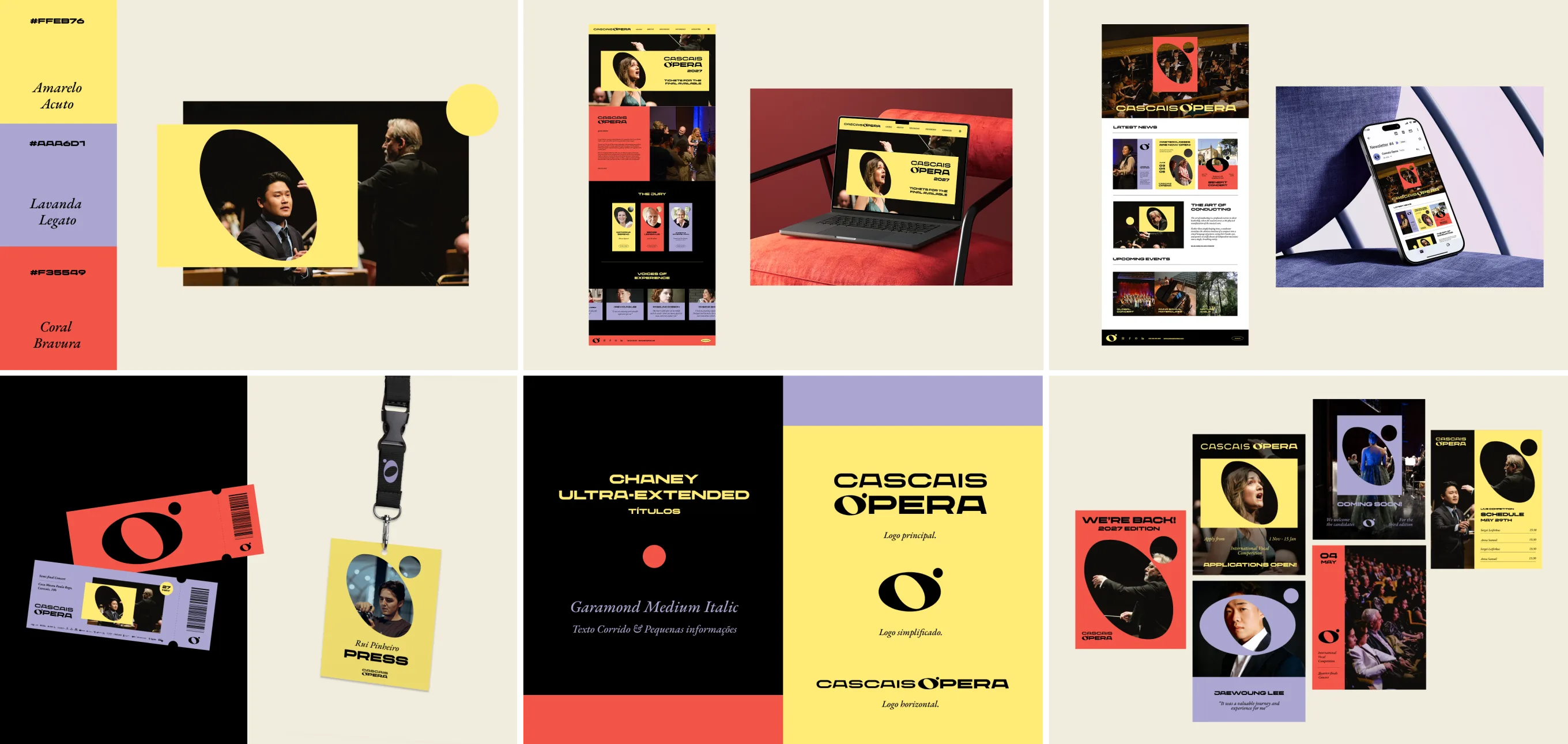
Proposal for the 2027 edition of the Cascais Ópera International Voice Competition. The identity challenges the idea of opera as something distant or belonging to another generation, introducing a bold visual language. A saturated colour palette and expressive graphic system bring energy to the classical world, positioning opera as a living part of contemporary culture.
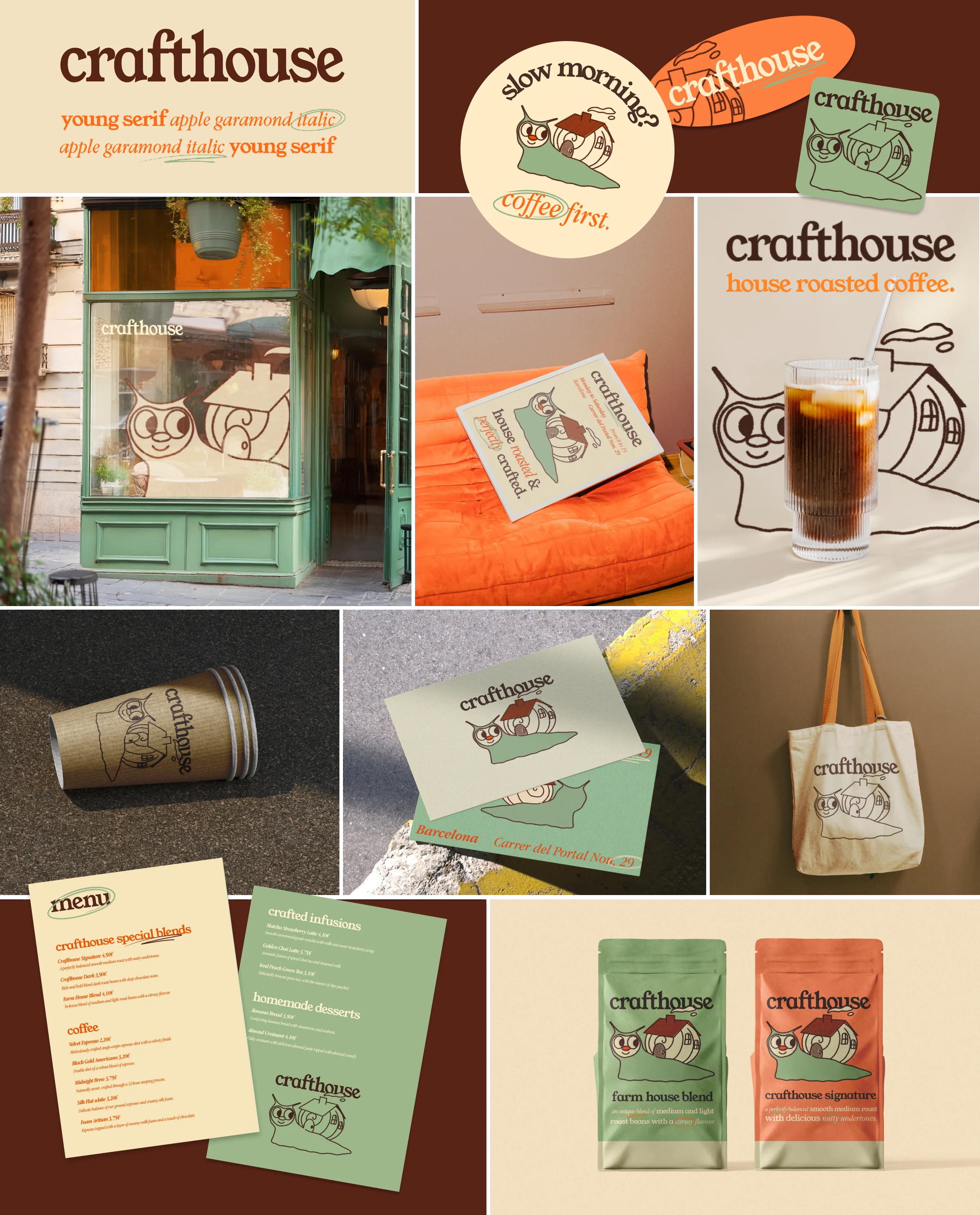
Crafthouse is a Barcelona-based coffee shop concept that brings together playfulness and sophistication. I developed the visual identity, from the logo to menus and supporting brand applications. The identity uses expressive graphic elements and a refined visual system to create a space that feels contemporary, inviting, and full of character.
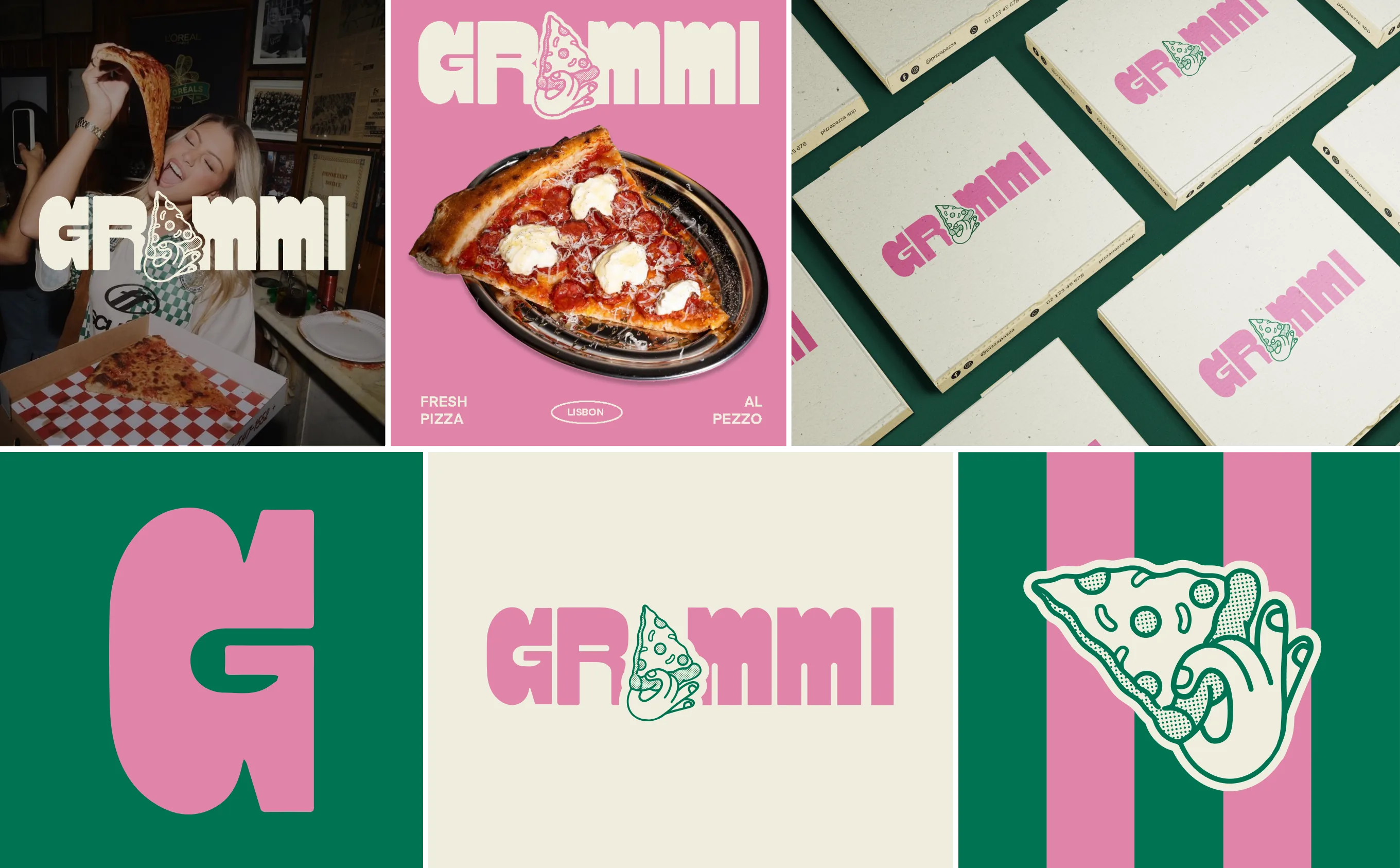
Grammi is a street-style pizzeria concept in Lisbon’s Bairro Alto, created around a young and contemporary audience. I developed the logo and visual identity, including a custom hand-drawn typeface and illustrated logo. The resulting identity combines a bold, playful approach with the informal energy and character of the neighbourhood.

Haaus is a branding project for an architecture, construction, and investment company focused on rebuilding and transforming existing buildings. The name combines the idea of the house with the initials of the two founders’ surnames. Drawing from the visual language of construction sites, the identity creates a contemporary system built around the house as a starting point: a meeting point between design, construction, and strategic investment.
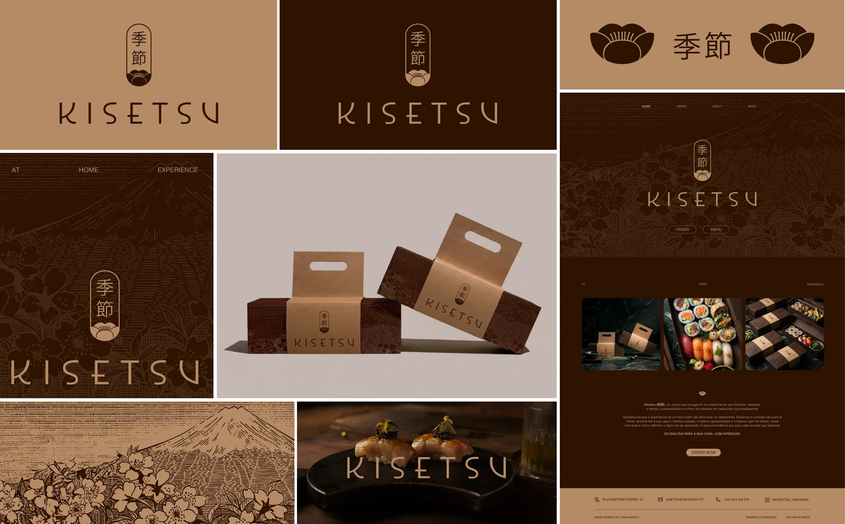
Kisetsu is a premium sushi delivery brand inspired by the changing seasons. I developed the logo, visual identity, and packaging, translating the concept of kisetsu (meaning season in Japanese) into a refined visual language. The cherry blossom becomes a central symbol of transition and renewal, while the packaging extends the identity into a premium and considered delivery experience.
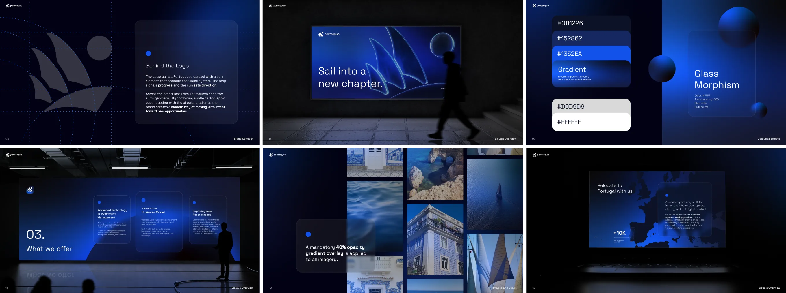
Porto Seguro is a branding project for an investment and citizenship fund. The identity combines a Portuguese caravel with a sun, creating a visual language centered around movement, direction, and opportunity. Circular markers and subtle cartographic references build on these ideas, resulting in a contemporary identity inspired by navigation and the pursuit of new horizons.
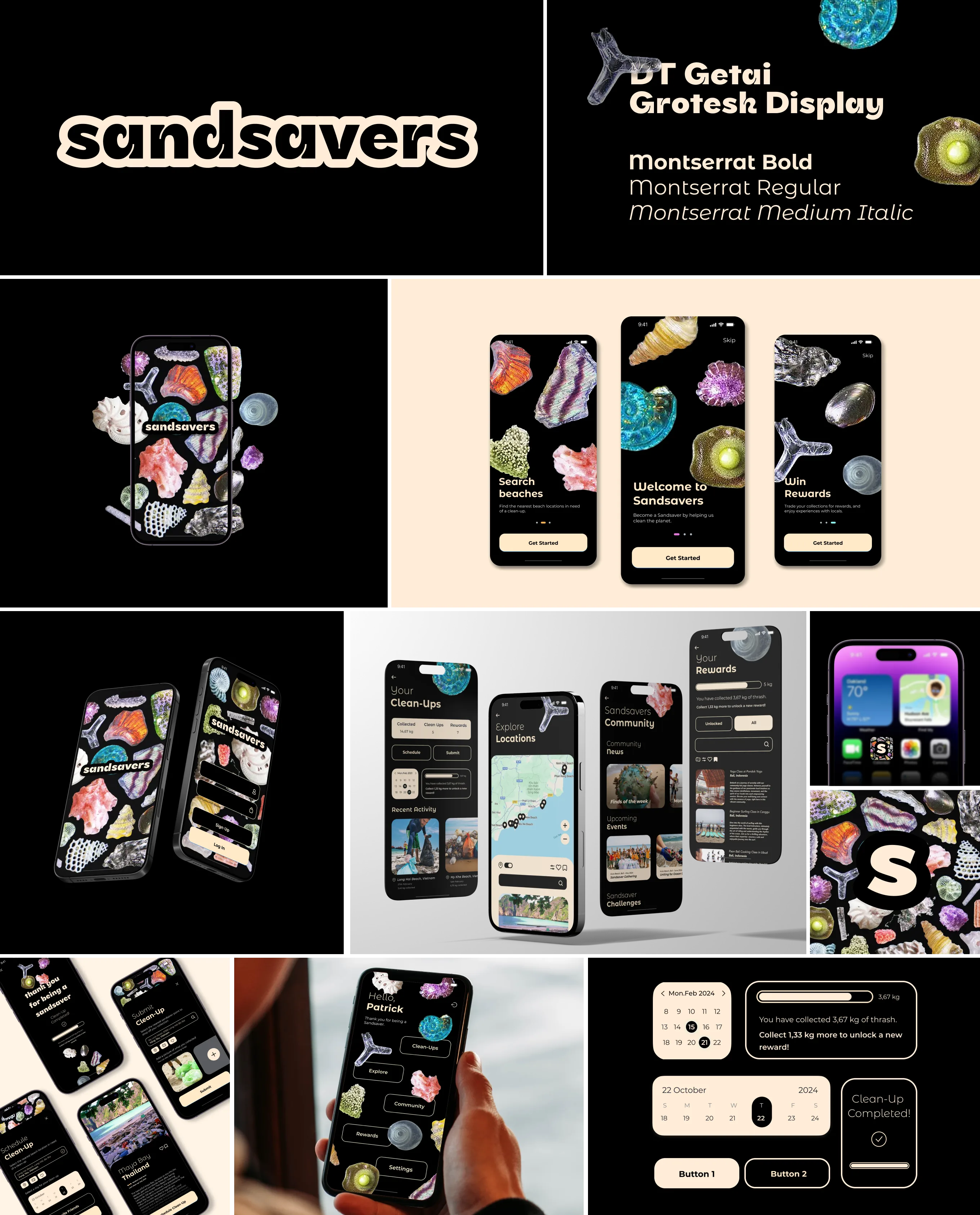
Sandsavers is a concept born from a trip to Southeast Asia, where the amount of waste on the beaches left a lasting impression. Inspired by the microscopic textures and forms of sand, I developed the brand identity and designed a digital prototype while exploring UX/UI design. The project reimagines beach cleaning as an engaging experience, connecting environmental action with participation, reward, and positive impact.
Shift Gallery explores the relationship between digital and physical art. Developed as a platform for 2D and 3D motion artists, the project translates digital work into lenticular prints while presenting the original pieces within a virtual gallery. As curator and art director, I selected and guided the participating artists and collaborated on the gallery’s identity, creating a bridge between the virtual and physical.
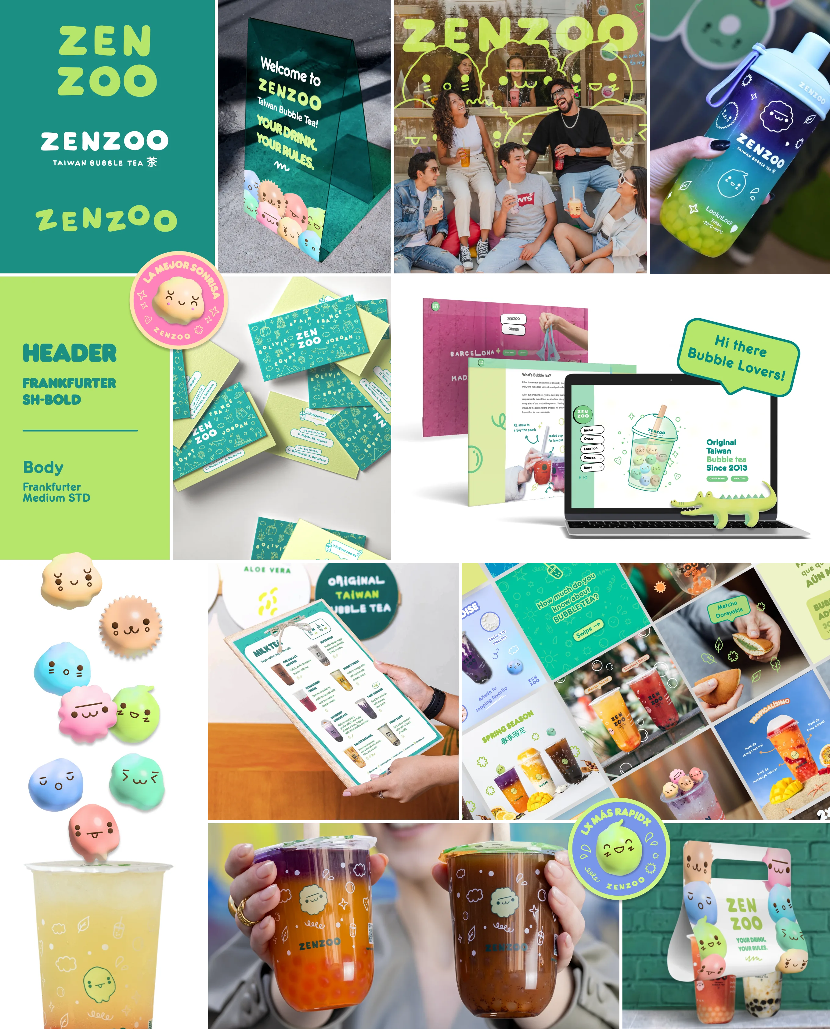
For over a year, I worked with Zenzoo, a Taiwanese bubble tea brand born in Barcelona, to refresh its identity and create a cohesive global visual system. I developed brand guidelines and designed key touchpoints including cups, business cards, social media assets, and other applications. The system was created to preserve Zenzoo’s playful character while ensuring consistency across its 10 international locations.